Primary Colour
This is Supplementary Information
This Pullquote is using the Primary colour. It's populated with all fields. The CTA is not going anywhere
The highlighted Content content type provides a text and image combination.
It offers the options to:
This is Supplementary Information
This Pullquote is using the Primary colour. It's populated with all fields. The CTA is not going anywhere
This is Supplementary Information
This Pullquote is using the Secondary colour. It's populated with all fields but does not have a CTA button. The text and image are reversed in larger viewports.
This Pullquote is using the Accent Primary colour. It's populated with only the title and main quuote/description.
This Pullquote is using the Primary colour. It's populated with only the title and main quote/description.
This Pullquote is using the Secondary colour. It's populated with only the title and main quote/description.

If you are unable to see or add a specific content type it may need to be enabled in your branch / section. Please email webteam@lincoln.ac.uk for support.
| Name | Type | Max Size | Required? |
|---|---|---|---|
| Name / Title | The text used in the heading in the copy panel | 80 | Yes |
| Supplementary Information | The text used underneath the name/title usually describing the purpose of the content type | 50 | |
| Quote/Description | The paragraph of copy below the supplementary information | 500 | Yes |
| Copy panel background colour | The background colour used in the copy panel area | 80 | Yes |
| Reversed? (Image on left, text on right) | Swaps the arrangement of the text and image to the opposite way round. | 80 | |
| Has CTA | Enable or disable the Call to Action | 80 | |
| CTA Ext. Link (only works if Has CTA is checked) | Select this option when using external links | 300 | |
| CTA Link (only works if Has CTA is checked) | Select this option when using internal links | 30 | |
| CTA Text (only works if Has CTA is checked) | Set the CTA text | 80 | |
| CTA Aria Label (for accessibility) | If the CTA button text is generic (e.g. Book Your Place) then fill in this field with more information. This will be added to an aria-label that will be used by screenreaders | 500 | |
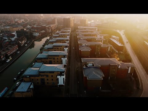
| Image | The image used on the right hand side, the image dimensions should be 640x426 | 80 | Yes |
| Video Youtube ID | Enter a You Tube Video ID | 11 | |
| Video YouTube Playlist parameter | This is the 'list' parameter shown in the embed code of the playlist e.g. 'PLKzEJk2fTGbvyaSBFR_rbzKDQzuenHDKy' | 100 |